Lessons from Rebrands
If the news of the Walmart or Kind rebrands happened to have shown up in your social media feed or you caught the stories on your news network of choice, you’re probably aware of the backlash from people stating both are just nothing burgers. Unlike other brands that’ve shown significant improvement (or epic failure) in their rebrands, these two were insignificant.
"What can I learn from these and other rebrands?" I ask for you...
Well, let’s break down some rebrands that have been:
- Way Off!
- Meh!
- Incredible!
WAY OFF!
These are rebrands that appear to have either reverted in their design approach, fallen deeper into an industry brand trap, or have entirely missed the mark of appearing to reflect their brand essence or connect with their audience.


Home Instead
Just a few years ago, Home Instead rolled out with the simpler logo showcasing the tulip icon, and I loved it. This shift from the more complex tulip on the “I” – using older fonts – to the simple tulip icon and an incredibly clean, modern font earned its place in my book, Branded by Design.
It held to the brand essence of everything Home Instead represented itself to be and stood out in a sea of other home care logos built with all the usual suspects of icons. But, then…
After just 2 glorious, short years the influence of the parent company, Honor, injected itself into the brand. You’ll notice the following:
- The font went away from the modern, unique styling to mat the same font as Honor
- The purple that carried some meaning with the stated brand essence of Home Instead was replaced with green – which is more complementary to the yellow in Honor than the brand persona Home Instead carried.
- The tulip icon replaced by a home… not only does this strip the logo of the human, softer touch emblematic of the tulip, it reverts into a brand trap – defaulting to a common image used by other home care agencies.
This last shift was far more corporate-focused than consumer-focused.
Baskin Robbins
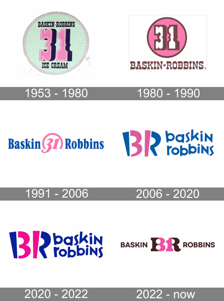
Growing up, I was quite familiar with the second and third of these logos.
When they came up with the third version in 1991, I remember thinking they suddenly must have become a less “local” or old-fashioned brand. It was quite the welcome change. Little did I know they could get more creative with their brand. Then came the change in 2006.
As someone who loves iconic subtlety, the logos from 2006-2022 are the best they’ve had in their entire existence. Even before social media icons were a thing, and favicons were barely the thing for URL browser tabs, the BR that also highlighted 31 was pure brilliance in design. The font was a bit spastic, but that hits with their target demographic and the variety of flavors and in-store experience for kids and families.
While it seems the latest is an attempt to revert back to their origins with the B and R, this new logo is a mess. You have old-timey style with the BR/31 combo, and a completely different font that is basic instead of either playful or retro. Unlike the 2006-2022 style where the 31 is clear in the BR icon, I see 81 with the new logo.
Retro nods can be great, but this is not one of those moments.
MEH!
Whether the brands below were good or not before a change was announced, these just don’t seem to have lived up to the hype made surrounding the rebrands.

KIND
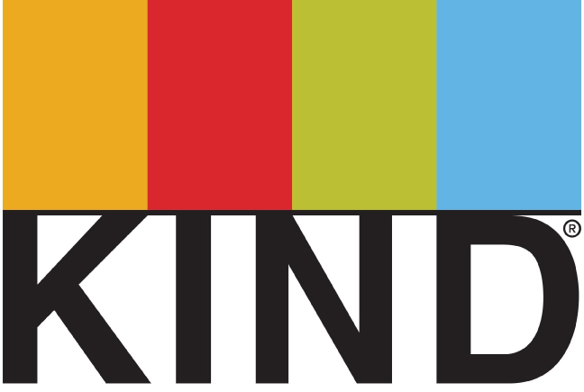
Don’t get me wrong. I love the branding of Kind bars. It’s incredibly simple, but I feel they hoped to create something out of nothing for an attempt at making just a slight pixel and position adjustment newsworthy.
They remain on brand-point with this change – which could have been accomplished without the noise they made with their videos and press releases.
The shift might have been enough to have people notice and talk about it, but forcing the conversation and doing a huge unveiling with people expecting to see something different was, well not very KIND of them.


Walmart
You’d think KIND might have learned from the “big” Walmart re-design.
Only three things changed with this “rebranding”.
- Darker blue
- Font Thickness (affecting both the text and asterisk)
- Ditched the rounding on the left sides of the bottoms of the W
Again, 90% of their consumer base problably would have walked into the stores not noticing a difference. But Walmart attracted attention about a change, leaving 100% of their consumers and many more who don’t shop there scratching their heads about what the noise of change was all about.
INCREDIBLE!
These brands surprised me with either updates. They simply did an incredible job making much needed updates to their designs.


US Department of Energy
Highlighting anything government-related as a good example of design was not in my bucket list, but this US Department certainly stands out!
Whether its department symbols or flags for state/federal organizations, the US has a long history of obnoxiously overcomplicated graphics. Yet, this logo could teach most businesses out there a lesson on logo design and symbolism.
Do you see it yet? The lightning bolt in the middle.

Interim Healthcare
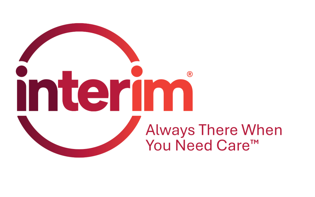
All I have to say is, “Welcome to 2025 and beyond, Interim!”
Ok… I do have more to say, but seriously. Look at how dramatically different this logo is from it’s previous version. Sure, the last version was devoid of all the industry brand traps in home care logos. But, it was quite dated in style and appearance for some time now.
Hidden symbolism I see (and I have not read anything from Interim about this new logo) that connects with what I know of many of their franchise owners:
- The circle is reflective of a community of care they encompass clients and caregivers into.
- The i’s. Yes, Interim. I love your eyes. They remind me of two individuals facing each other who are also part of the circle.
I’ve wanted to see a change in this logo for some time, and this one has not disappointed.


Griswold
Within the previous logo were the most common symptoms of the industry brand trap for home care: Heart, home, red, and blue.
Seriously, though. Do a search online for home care businesses and you’ll see these four elements in most logos.
However, their new logo brings a far cleaner font that’s more legible on devices than before. The text color is a deeper blue so it doesn’t seem as common. The icon departs from both the common shapes and colors in the industry.
Going for abstract instead of off-the-shelf stock approaches to their icon, the new logo reflects the assurance they hope to deliver through people and connections.
This is another great moment in branding where the experience and value were at the forefront of design instead of the “what we do” taking over.

OCHA Home Health Services
In 2023, I was presenting on how to more effectively promote and brand your business online. This covered proper brand image and messaging, as well as targeting the right-fit audience. After Q&A was done and I was getting ready to leave the room, I was approached by the owner of Ocha Home Health Services, Corp.
“What do you think about my logo?” Adis asked me.
I looked down at a business card with the heart and EKG combination logo pictured above, along with her company name in about 7-point font. Unable to read it due to early symptoms of being at that age of needing readers, I asked her to tell me the name of her company.
During less than 10 minutes of discussion about what her agency values and essence are, as well as what people recognize her for, there was one thing that stood out. The red and white umbrella she takes everywhere – and had with her at that moment. “Everywhere I go, people recognize me because of the umbrella,” she said.
So, on my way home, I sent her the middle “re-imagined” mock-up of a logo and a few weeks later, a new brand image was born with the “New Logo”.
Soon after, her website and other marketing assets came to life under this umbrella that reflected the coverage of care they provide. And what she’s recognized for when she and her staff are out in the community is how they can recognize them from other home health businesses anywhere they appear – online, at events, hospital fliers, etc.
Is your brand on-point?
Do the fonts, colors, and icons in your branding reflect the WHY behind your business and connect with the values of your prospects?
Are you experiencing the 7-year itch about any aspect of your brand image and voice? If you’re feeling it, you can guarantee your right-fit audience is seeing some disconnect.
Let’s connect to help your business avoid or escape the industry brand trap!
