I saw a job listing the other day with the title DIRECTOR OF FIRST IMPRESSIONS. “Wow,” I thought, “What kind of job must this be?” Turns out it was a creative way a business owner (who it turns out I know) is trying to attract a certain caliber of full-time receptionist. Certainly, the job stood out among all the other similar job postings. Other job postings for receptionist stated simply “Receptionist” or the ever classic “Administrative Assistant.” Point is, for better or for worse (you decide), this listing stood out among all the others. The employer shared what he considers the most important role of this position in the job title. In fact, if you were to look at various job postings out there, you can quickly form opinions, both positive and negative about what you find. Similarly, a business’ presence online can be just as impressionable on visitors to your website.
Businesses who have seen the advantages of getting a website online have an advantage over other businesses. Some saw this advantage early on, and were quick to jump on board after the internet became publicly available. Unfortunately, many have also neglected their websites. This means, at some point or another, their website will actually become a detriment to their business.
Here are some obvious signs a website is out of date and in need of updating:
 A Website with Flash
While the era of FLASH designed and developed sites brought some interesting and highly interactive elements, they no longer meet modern design and development standards. Such websites now have various issues in performing in today’s world of devices. The first issue with these websites actually came right from the start. The requirement of external software on a users computer made experiencing a website entirely dependent on whether or not they had Adobe FLASH installed on their computer. Now, FLASH websites aren’t compatible with devices like smart phones or tablets.
 Browser Compatibility
Sites that are approaching 5-6 years in age could begin experiencing complications in continuity in appearance between browsers – even if they were built with the major browsers considered during development. To meet the ever evolving demands of technology, browsers like Chrome and Firefox are constantly updating. Internet Explorer generally does its updates through version releases (i.e. IE 9, 10, 11 etc.) which users are required to manually perform. If your website designer fails to check for cross-browser compatibility, styles like fonts, gradients and shadowing could appear quite differently from one user to another. It’s important to keep apprised of how your site appears in various browsers and which are the most popular for your target audience. If you have Google Analytics installed, you can see which browsers are most commonly used by visitors to your website. You can also see which devices they are using to access your site as well.
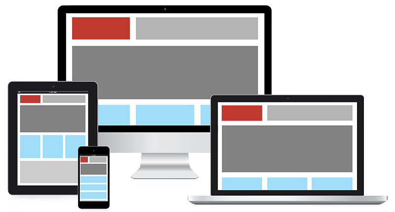 Keeping up with Technology
The growth in use of smart phones and tablets isn’t going anywhere but up, and if you’re not providing a more user friendly experience for visitors to your website for these devices, you could be missing out on a significant amount of conversions. Any business that used to be competetive in and benefit immensly from advertising in the era of the yellow pages is especially to gain from not only having a good search presence online, but also from a website build with smart phones and tablets in mind – meaning a quick and easy way of contacting is easily found and used. Having your brand, a phone number to call (that is click-to-call) and a drop down menu to navigate the website are the three most important elements to have in view when the site is brought up on a smart phone. Other features, like a form to complete or products to purchase are quick to follow, so they might appear more readily accessible on tablets. Catering to the design working optimaly on smart phones and tablets also means having a much cleaner and effective full view website.
 Small, Poor Resolution, Old, or Hokey Images
Perhaps, when you built your website, you were scanning in print photos to convert to digital or the digital camera you used was only 1.2 MegaPixels… Well, that was a long time ago, and most cell phones take higher quality images than you could have gotten a decade ago without having to hire a professional photographer. With improved technology available to take pictures and a plethera of stock photo sources, it’s easier than ever to keep images on your website fresh and sharp as technology demands higher resolution imagery for the optimal user experience. Also, while they can be tempting and you might personally get a kick out them, hokey images are just that. Hokey. Unless your website is about being silly, avoid poorly animated or overly exagerated expressions often found in images on websites. They don’t give a professional impression to your site visitors and come across old school. You certainly don’t want to appear over the top like some discount radio shop commercial from the 80s.
In keeping current with technology and design standards for your website, you’re not only better able to reach your demographic of customers/clients, you’re showing them you are an active and thriving business.